how to process photos for impact
Recently I was asked to help processing my cousin’s holiday photos. He wasn’t happy with the results he was getting and thought I could have a fresh approach. It was a great opportunity for me to have some fun in lightroom without the baggage of seeing the locations myself. If I don’t know what the place really looks like I don’t need to worry about the reality and I can go crazy with LR adjustments! I ended up writing a tutorial for him that I present below.
Disclaimer: I pushed the image beyond what I usually do just to show what is possible (and have some fun).
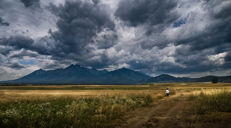
Photo by Piotr Niemczyk
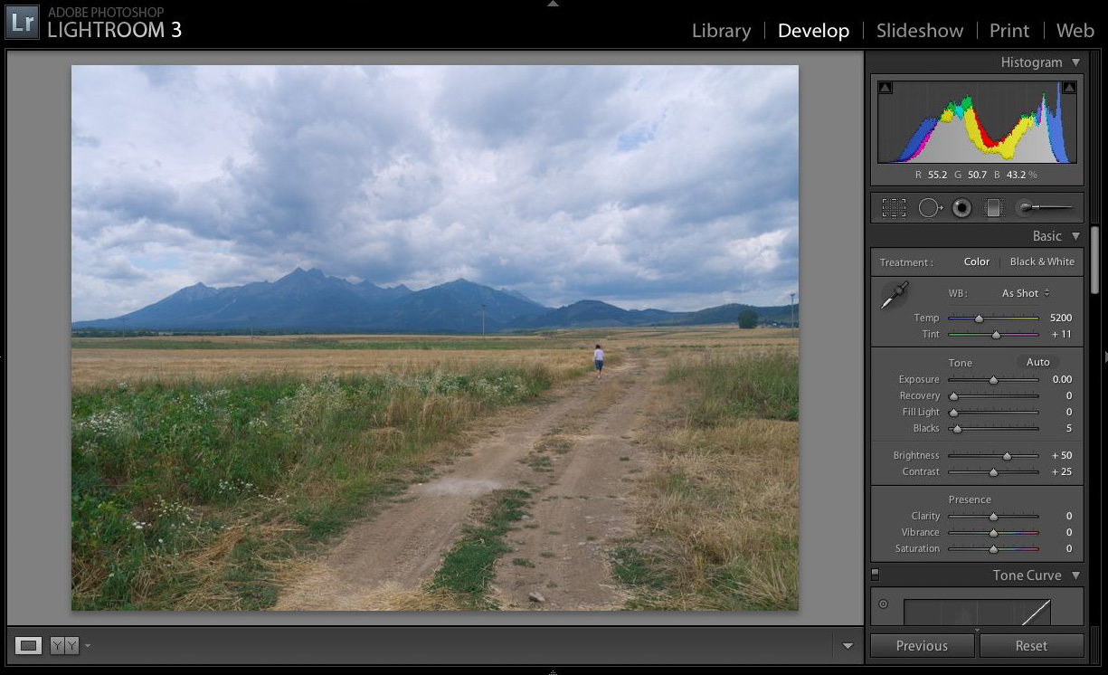
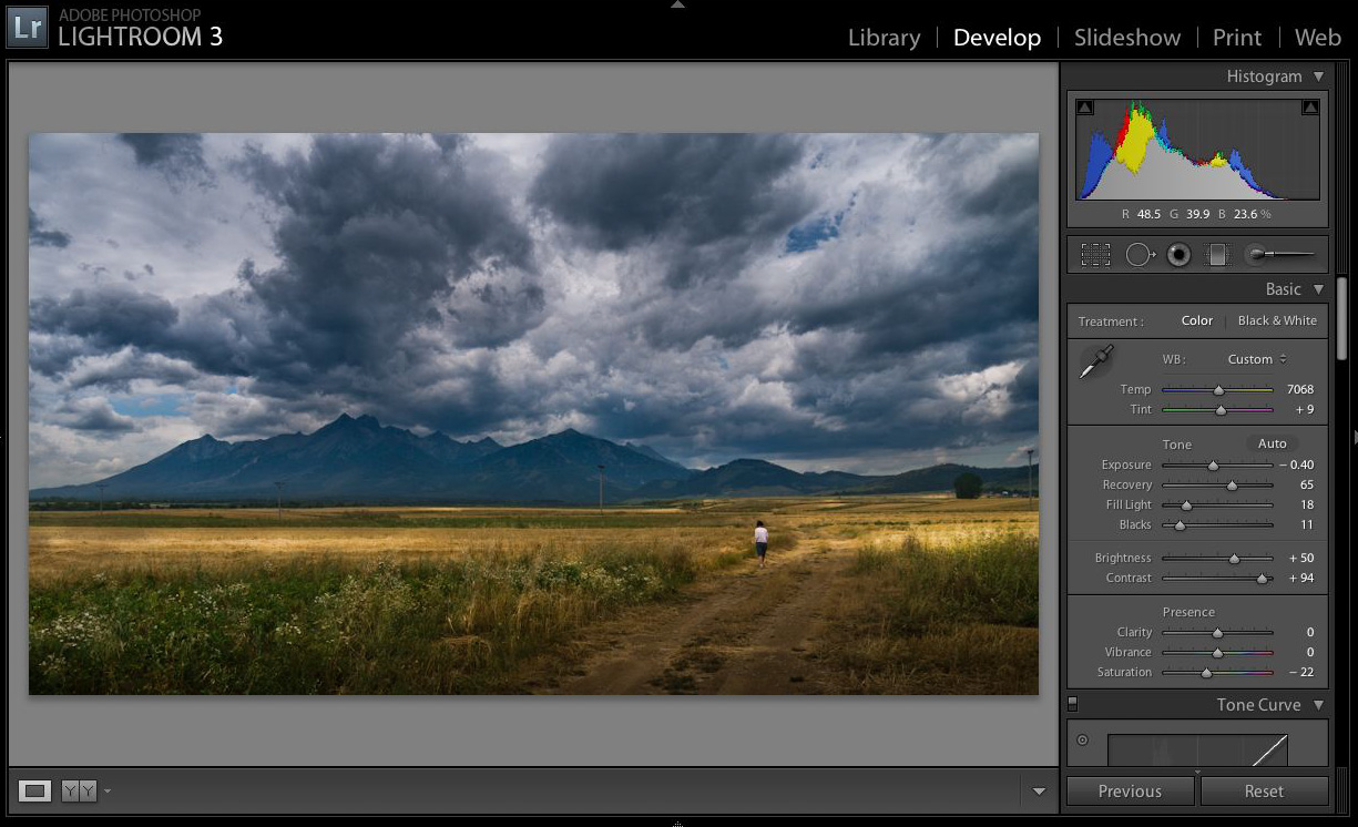
Below is the same photo without any adjustments. Just default lightroom settings.
As you can see default LR processing is not very interesting. It is default – it is supposed to fit as many purposes and workflows as possible. Some people believe that this is the ‘true’ processing that shows the reality. I’m really sorry for them if they really see the world in such a bland way. Besides who cares about reality? We are making a photo here, we want it to be interesting and stand out from the millions of others.
“You don’t take a photograph, you make it.” ― Ansel Adams
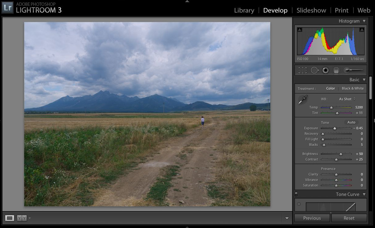
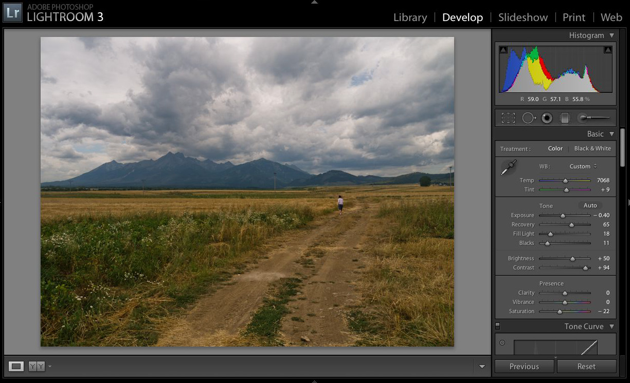
Exposure
The first thing I usually do is some exposure adjustment. With digital cameras I’m a bit careless with the exposure during shooting as I know I have some room for mistakes. I’m careful to keep my highlight under control and “exposure to the right” but I’m not obsessed with it. Often I under expose just to be on the safe side. Personally I don’t mind noise but I hate blown out highlights especially on skin. It is ok for black and white but looks ugly in colour. Even if I get exposure wrong by one f-stop I can recover that mistake in LR. In most cases at least. In this case I nudged the exposure down a bit to recover information in the sky. I could have done it later and most likely I will tweak exposure a few more times before I’m done with this photo.
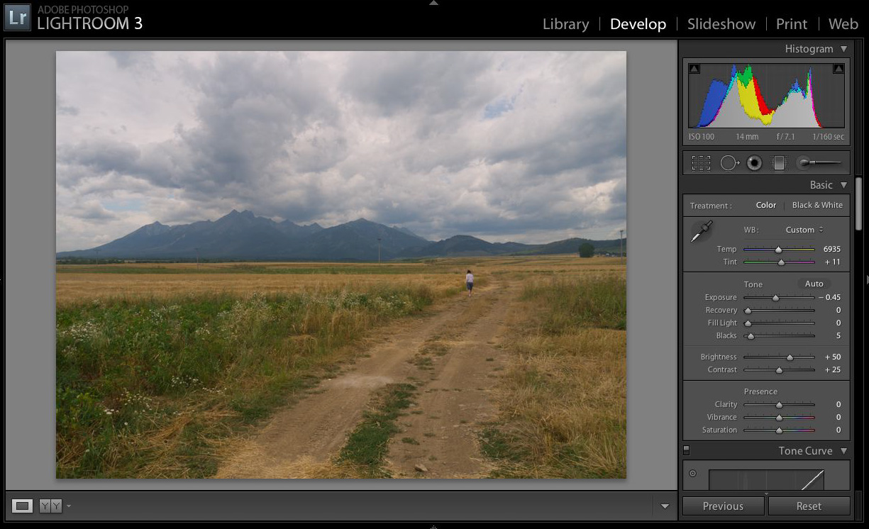
White Balance
Next comes the white balance. Personally I never ever (like really never ever) use auto white balance in my camera. Why do we have such a stupid setting? It will ruin every sunset and golden hour, it will neutralise beautiful blue shadows it will make your photos bland like default LR processing. The colour temperature of your surrounding changes and it is true that your eyes will compensate for it but your brain will be still aware of the compensation. That’s why you like golden light in the evenings. If you change WB of the photo your brain doesn’t need to compensate any more and you are missing out. So my camera is set to 5500K. Permanently. I use LR white balance setting as a creative adjustment only. Those two sliders can completely change the mood of your photo.
In this case I made the photo a bit warmer. I know sky looks weird now but I’m not done yet. I’m trying to find the middle ground here for the rest of the processing. I will get back to the sky later.
Contrast / dynamic range
This step usually requires a few adjustments done in a loop until the desired effect is reached.. Often I go back to exposure too. For me contrast is the strongest and the most important aspect of a photo. Our brains use contrast a lot to allow us to understand the scene we see. Here you can find a collection of visual illusions all based on our contrast and brightness perception:
http://www.cns.nyu.edu/~david/courses/perception/lecturenotes/brightness-contrast/brightness-contrast.html
In photography we are limited by the devices we use to display a photo (computer monitors, prints etc). All of them have limited contrast ratio. We need to remember that we cannot compress all available dynamic range of the real world into a limited media we work with. If we do that we will end up with overall much lower contrast ratio and our brains will know that something is wrong with the picture. Well, some people don’t mind it and go crazy with multiple exposure and tone mapping. Personally I think we need to sacrifice some tonal range in a photo to retain contrast.
Contrast algorithm is pretty basic – it just makes bright parts of the image brighter and dark ones darker. High contrast applied to the source image would result with a very dark ground and blown out sky. We lowered exposure to help retain information in the sky but it is not enough. Luckily lightroom provides three (L4 provides 4) sliders to help adjusting highlights and shadows independently. With fill light I can bring some ground details back to the photo and with recovery I can reduce overexposed areas in the clouds. It seems a bit contradictory – first I say I want contrast but later I reduce contrast by darkening the sky and brightening the ground. Well, it is true. We have two huge areas on the photo – one very bright and one very dark. having a lot of contrast between them will not make our picture compelling. We want to have a lot of contrast but in smaller areas. So we lower overall dynamic range of the image by lifting shadows and pulling down highlights. We need to be careful here as it is easy to overdo it and end up with mostly color information without any lighting. Overdone images are know on the internet as HDR. The correct name for this technique is actually tone mapping but I will not go there in this tutorial. Anyway a RAW photo has enough information to do a bit of tone mapping without the need of multiple exposure. By tweaking contrast, exposure, shadows and highlights together I can balance the image a bit better.
Keep in mind that increasing contrast also increases saturation of the image. Often a bit of desaturation is necessary to pull the image back from fairyland.
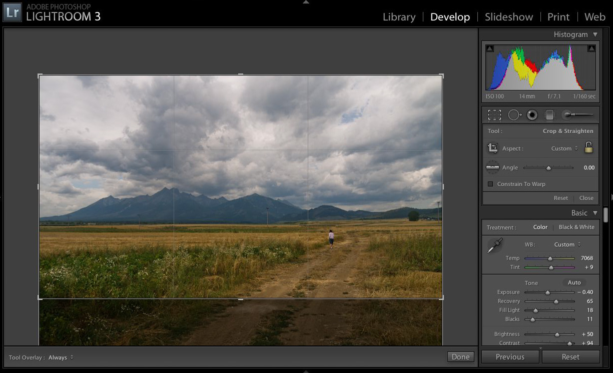
framing
This is by far the most important aspect in photography. Good framing = good photo. It can be badly exposed, taken with a phone camera but if it is well framed (on a good topic) it is good. I always very carefully frame photos when I shoot. I allow other mistakes in the process (missed exposure for instance) but the framing has to be as close to perfect as I can get it. Other equally important factor is focus but this is a technical problem not a creative one (in most cases). This photo is framed centrally and that allows me to choose what I want to show after it was taken. Usually I make that decision on the spot or I take two photos with different framing when I cannot decide. By following one of the simplest rules – the rule of thirds – I can either have 2/3 of the ground and 1/3 of the sky or the the other way around. The ground is not very interesting but the sky has a lot of detail and is great to set the mood for this photo. If the road was framed more from left to right I might have preferred it to the sky.
gradients
So far I applied broad changes that affect the whole picture. Next I can apply, still pretty big, changes to parts of the image. Gradient tool is the most powerful tool in LR and one of my favourites. I usually use gradients to direct focus of a viewer to the topic of my photo. Here first I used a darkening gradient (exposure, contrast etc) on the ground. Bottom of the frame is not very interesting and I want people to focus their attention on the lonely figure and stormy sky. I want to tell a story and have some impact on a viewer so I try to guide him/her into areas of interest. Then I use a few more gradients to tweak the sky, fix the yellow tint I got from white balance and push it even more to make it more ominous.
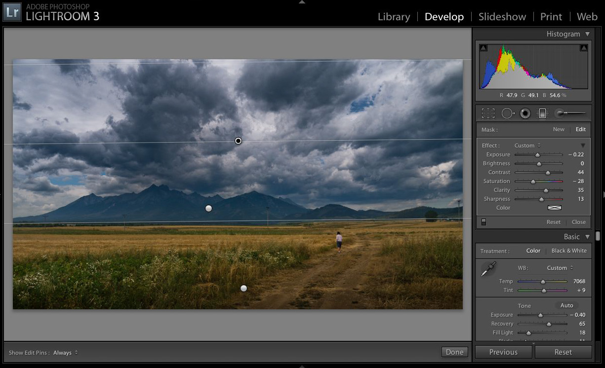
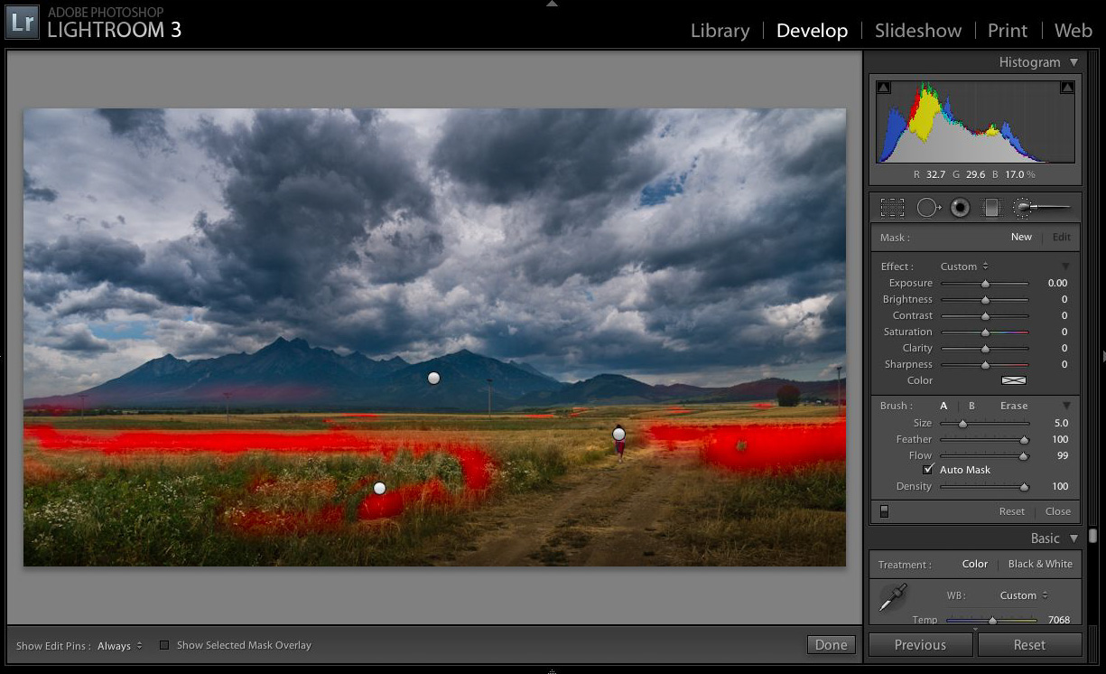
brushes
after gradients I have an ability to apply even more localised changes using brushes. The ground has a bit patchy look to it and it feels like there was some sunlight trying to get through the clouds. I helped the sun to get through with a brush :-). Without it the picture was too dark and still a bit low contrast, there was not enough light there. I know some people will say “hey it is cheating”… well, remember we “make photos”. Dodging and burning was part of the darkroom workflow of all great photographers for many years. Just get used to it and start using it.
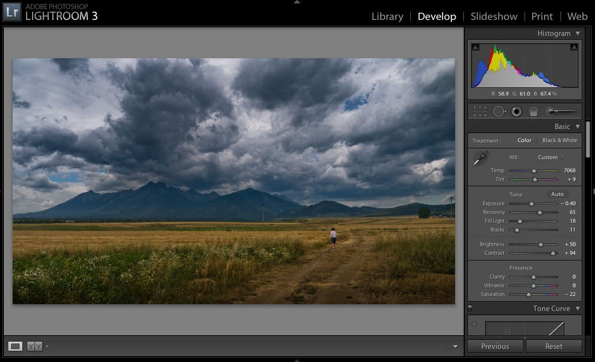
Now, I’m not claiming it is a better photo than the original. It is just my interpretation and it is a different photo. Some people will like it better, some less. The point is – it is my photo now (well kind of, if I have taken it), my interpretation, my art and I like it.
Photo by Piotr Niemczyk